How to Make a Cool Background for a Vector Character

Combining different visual elements is an important part of the graphic design. In this tutorial, you will learn some basic rules that will help you to improve your design skills. The subject is How to Make a Cool Background for a Vector Character, so let’s begin!
Shapes
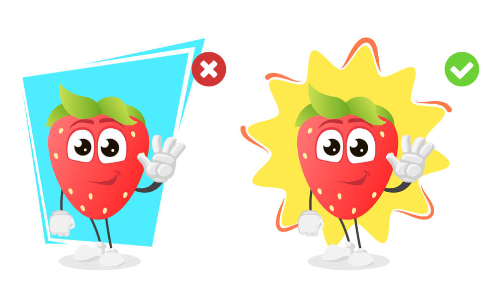
In terms of the background shape, the style of the character is a very important factor to consider. If we have a cartoon character with a rounded shape, we should pick a background that complements this shape.
Here is an example with a Free Strawberry Cartoon Character made in a rounded shape. The blue background on the left is fighting with the style, whereas the yellow background on the right is complementing the character clipart. It looks like the strawberry was made with this background from the beginning.
Keep a good contrast between the vector character and the background
When choosing the background color, keep in mind that there must be a good contrast between your character and the background. The background is not the accent, the character is.
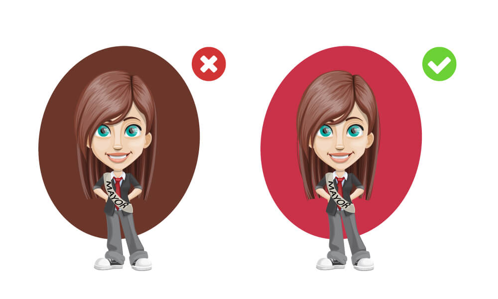
The background’s role is to help the character grab the attention of the viewer. In the example below, the first background is made with a color similar to our Free Vector Girl Character‘s hair. In this situation, the hair gets lost in the background. This background color is not helping the character – it’s ruining the character.
On the right side, on the other hand, the background is helping our vector character grab the attention because it is contrasting to the girl’s hair and clothes. It is also similar to one of our character’s colors – the tie but they are not merging. So, it’s okay to use this color as a background color.
Here is another example: A Flat Vector Character Man Holding a Blank Paper. On the left side, the grey background is in such a tone that makes the paper almost invisible. But if we brighten the grey, then the paper is readable and the composition looks better.
Choose a color that complements the character
Choosing different colors to make a good contrast is right, but if they complement the design, it would be even better.
In this example below, this Free Vector Schoolboy Character pops perfectly. The colors are contrasting enough but there is another problem. In the composition on the left, the colors don’t seem to be harmonious with this vector character. But if we use colors that represent the natural environment for this character, such as a school environment, then the whole composition would look more harmonious. Plus, it would make the whole vector illustration much easier for the audience to understand.

How to Make a cool background for a Cartoon Character – choose a color that represents the character’s natural environment
Lighten the background color to make the character pop
The character will stand out even more if you use a lighter shade of the background color. Here is an example of the same composition made with different background shades.
This vector mascot (Free Vector Snail Character) is presented in his natural environment – there is the sky, the grass… However, in the example on the left, the background is too bright for the character to pop. It also merges with his shirt. On the right sight, in contrast, the background is much lighter, making the vector snail stand out a lot better.
Distort the background shape to give a perspective to the Vector Character
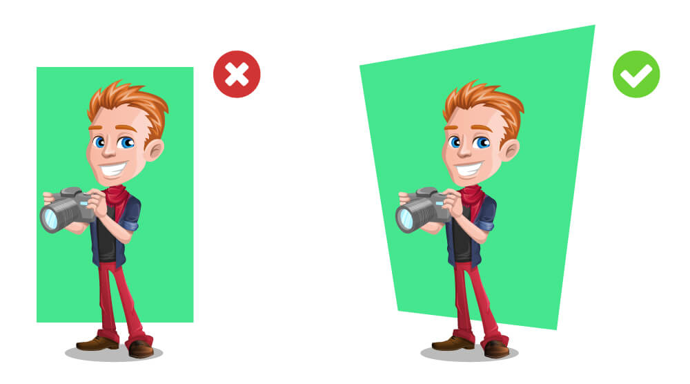
The background should enhance the Cameraman Cartoon Character‘s appearance. The whole composition should feel light, natural and breathing.
Check out two examples. Does it seem to you that the composition on the left feels unnatural? No wonder. The character is positioned too close to the background’s edges, and there seems to be not enough space between the character and the background.
In order to achieve a harmonious and breathing composition, distort the shape of the background to give it a little bit of perspective.
Get the character out of the background
The character will pop even more if you make him like he is standing in front of the background. As you can see in the examples below, there is a huge difference between the left and the right composition.
In the first one, the vector character looks like he’s immersed in the background, whereas the second one makes him look like he is standing in front of it, therefore keeping the focus on the character.
To achieve this effect, get some parts of the cartoon character out of the background. We’ve put the legs of the character out of the background, as well as his camera.

How to Make a cool background for a Cartoon Character – make your character in front of the background
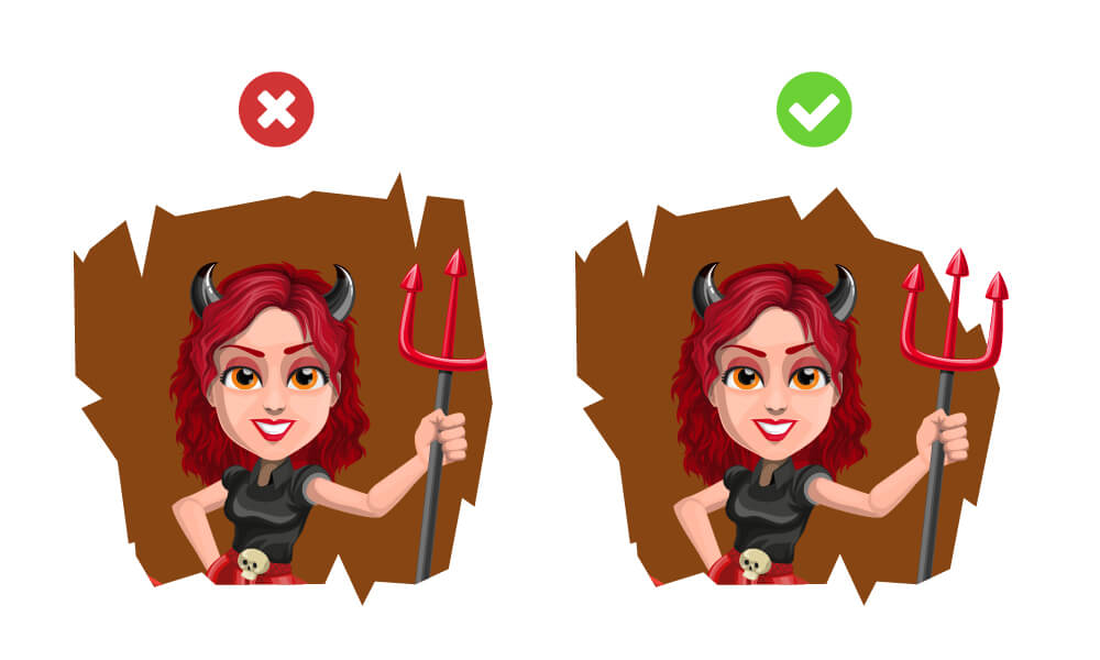
Even if your character is positioned in the background, just like this Free Vector Devil Girl Character, you can still juice up the composition. In this particular example, we’ve moved her trident out of the background to make it look like she’s reaching out towards the viewer with her hand.
Use the symbolism of colors
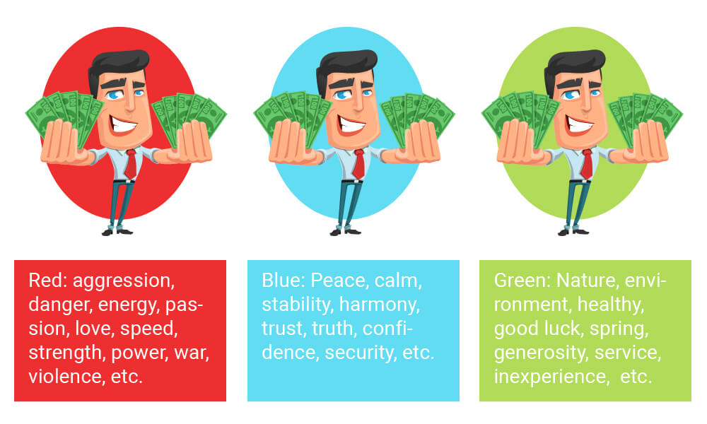
Choosing colors in graphic design is not an easy job. There are many things that you should take into consideration when choosing the right colors. The character’s colors, the contrast, the situation, etc. are all important factors.
But when choosing colors, you must also think about what you want to say to your audience. Every color has a meaning that every person associates it with. For example, Red is associated with alert, aggressive, passion, evil and more. On the other hand, we associate Green with GO because of the traffic lights, but also with peace, nature, ecology, etc. Take a look at the picture below and think about what you feel when looking at each composition.
Conclusion
There are many useful guidelines in graphic design. Still, the most important advice is: try different things. The guidelines can be broken, depending on the project and the particular vector character. Try different things and you will find your style.
If you are interested in where to find cool backgrounds, check out some of these related articles:
Website Backgrounds: 18 Sources to Find the Perfect Background
56 Impressive Free Presentation Backgrounds for Outstanding Presentations
Also, if you want to make more professional backgrounds for your characters, this Seamless Pattern Designs Bundle may be useful. Cheers!
