How to Create an Effective Presentation with a Character or a Mascot

Making appealing presentations is a must-know skill in today’s world. Presentations are used in many different ways. They help you present an idea, show results, announce events, etc. These days it’s essential to know how to make interesting presentations. Presentations that nail the attention, don’t bore the viewers, and look aesthetically good.
In this article, we will share some practical advice to make your presentations look professional, interesting and effective.
First of all, think about how you feel when all you see on the screen is some boring statistics and text, without any images. Not so appealing, right?
In order to create an effective presentation, we need to invest more time in finding the right images and illustrations. The most popular and easiest way to make interesting presentations is to find good characters or mascots and include them in your PowerPoint presentation. There are many sites where you can find such resources:
- VectorCharacters – our site offers over 1,000 FREE vector cartoon characters, that are perfect for illustrations;
- Freepik – one of the biggest networks for freebies and pictures;
- Vecteezy – huge collections of free vector graphics for presentations;
- FreeVector – one of the biggest sites in the world for vector graphics;
- GraphicMama – the perfect network for this purpose. It has over 500 cartoon characters with over a hundred poses for each.
After you’ve picked your cartoon characters, you need to understand how to use them in your presentation in order to make it more powerful and attractive.
You may be interested in 56 Impressive Free Presentation Backgrounds for Outstanding Presentations
Don’t lose the focus
The presentation’s purpose is still the same – to present information. The cartoons and images are only added to make the presentation more attractive.
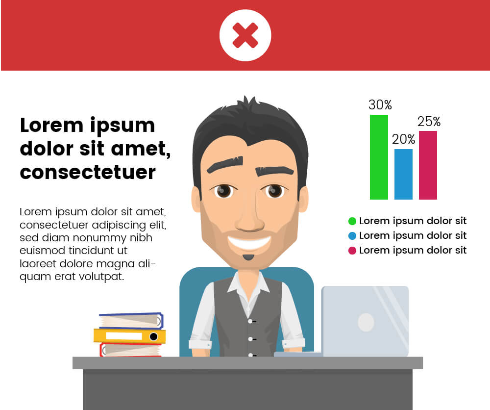
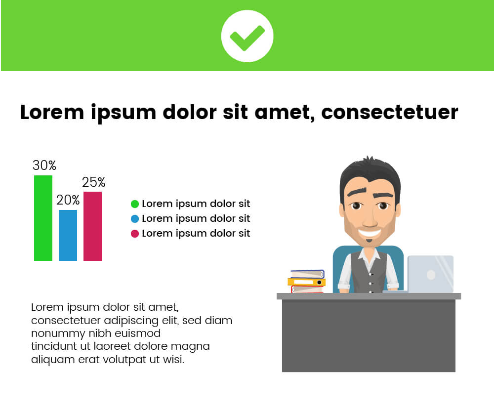
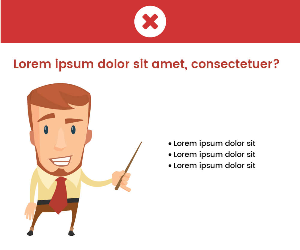
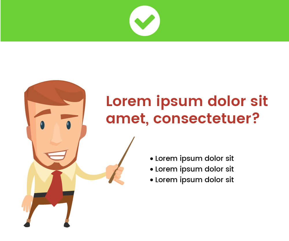
Give your text enough space. Do not put the accent on the cartoon character. Arrange your text and data first and then find a place for your character. Check out the following two examples below. Feeling the difference?
In the first presentation slide, we’ve put the character first and centered it. Then, we put the text where there was space left, thus bringing the focus on the illustration. This is not really the point, isn’t it?
In the second example, we’ve put the text and data first, leaving enough whitespace around them. The whitespace or negative space makes the elements breathe. They are readable and notable. Although the character is not the accent, he’s still serving his purpose. He is friendly and welcoming, making the viewers inclined to accept the message effectively.
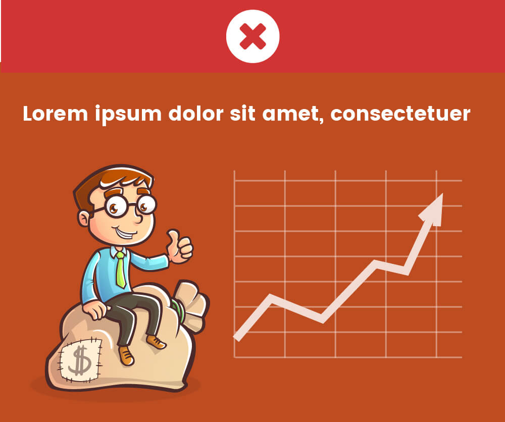
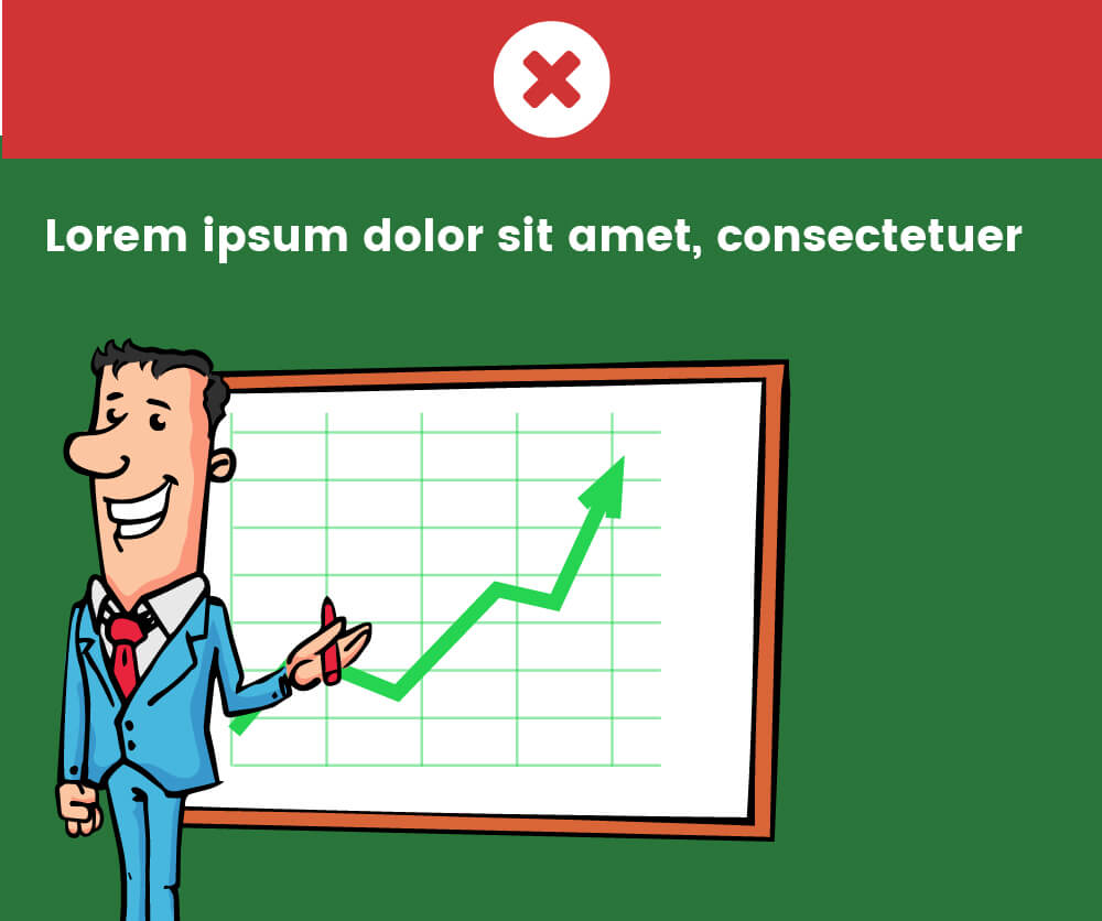
Use colors wisely to convey specific feelings, and match the cartoon character with the information.
See two examples. The cartoon character we’ve used is placed well but the background color doesn’t really correspond to the positive statistics given.
Here is what the colors mean:
- Red – aggressive, alert, bad
- Blue – calm, relaxing, peace
- Green – Eco, Go, positive, profit
Now, look at the second example. The background color is green which makes the viewer feel a positive energy better.
Check out 70 Inspiring Presentation Slides with Cartoon Designs
Think in terms of the composition
We’ll show you two examples again. In the first one, the illustration is good, the graph is well placed on the whiteboard. Still feel there’s a problem? You’d be right. The graphic is left centered and the cartoon character isn’t looking at the whiteboard.
Now let’s rotate the cartoon character to make him look at the whiteboard. This will instantly move the visitor’s eyes to the character’s point of interest.
It will also feel better if we scale down a bit the illustration in order to get his legs into the presentation. And then, align the illustration to the center. How does the composition feel now?
Use the character’s pointer wisely
It’s clever to use a character to point to our information… literally. You can find many cartoon characters made for this purpose. They definitely help present ideas better.
Let’s explore two examples. In the first one, we have a presentation guy with a pointer. But the title is above the character and he’s pointing to nowhere. Use the character’s pointer to direct your visitor’s eyes to the important stuff in the presentation.
If we move the text a little bit downwards, so that the pointer is directed right towards it, the composition looks much better.
Even if the cartoon character doesn’t have a pointer, they may be looking at some direction or showing something with their hands. Use these poses to your advantage in the presentation.
Conclusion
Every presentation is individual, so the use of illustrations depends on many factors. We hope these basic rules will help you make better presentations.
If you liked this article, we will be glad if you share it with your colleagues and friends. Thank you!
You may want to check out these 12 PowerPoint Presentation Tips To Dramatically Boost Your Efficiency
MultiSplash – Presentation Templates Collection
77 Premade presentation templates compatible with PowerPoint and Google Slides.
